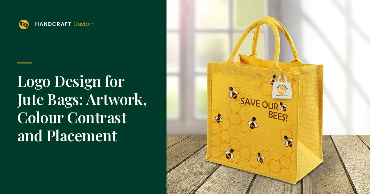
Logo Design for Jute Bags: Artwork, Colour Contrast and Placement
A logo that looks crisp on a monitor can lose its fine lines once it is printed across a jute weave. Before the artwork goes for a quotation, marketing teams can make a handful of design decisions that decide whether the brand reads clearly on the finished bag: how big the mark is, how it contrasts with the fabric, where it sits, and how much else shares the panel. Good logo design for jute bags is mostly about these practical choices.
This article covers visual design choices. Preparing print files and order details is covered separately in the printed-jute-bags guide, and deciding whether a branded bag suits a campaign at all is covered in the marketing-campaign guide.
Design for the distance people will actually see
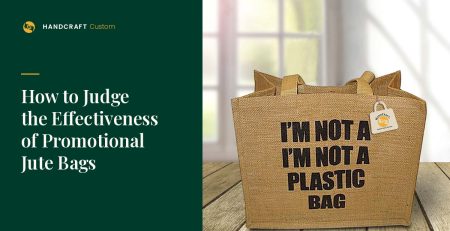
Most branded bags are seen at arm’s length or across a room: at a registration desk, on a shoulder in an exhibition hall, or on a commute. Choose the one element that must be recognised at that distance, usually the logo or the event name, and give it the space. Taglines, web addresses and sponsor rows compete for the same panel and often make the main mark smaller.
- Start with one primary element and decide what can move to a second side or a separate insert.
- Prefer solid shapes and confident line weights over hairlines and small serif lettering.
- Test the artwork printed at the real intended size, not scaled to fit a slide.
Contrast on natural-colour fabric
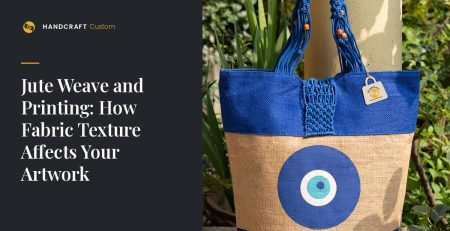
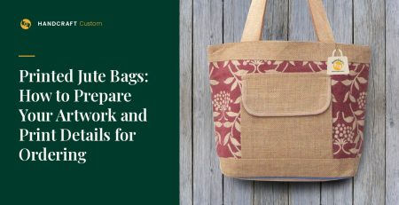
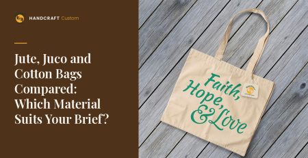
Natural colour means undyed jute or cotton, so the background is a warm, textured tan or off-white rather than a flat white. Pale tints, light greys and some yellows can almost disappear on it. Dark colours and strong mid-tones usually hold better. If your brand palette depends on a light colour, discuss whether a contrasting outline, a coloured bag body or a smoother fabric such as juco is worth the extra cost. Juco is a premium option, generally chosen when better print detail is needed.
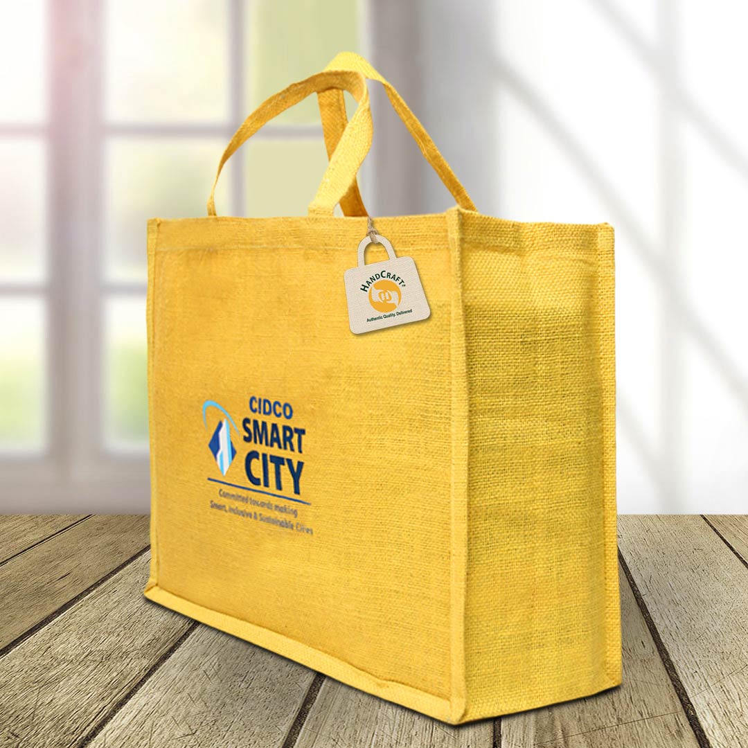
Coloured or dyed bag bodies change the contrast calculation entirely. Dyeing adds two weeks and extra charges, so decide early whether the design genuinely needs it.
Placement: work with the bag’s construction
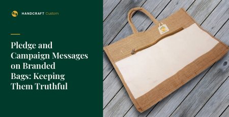
The usable print area depends on the actual bag. Seams, side gussets, pockets, windows and handle attachments all reduce or interrupt the flat panel. Before finalising artwork:
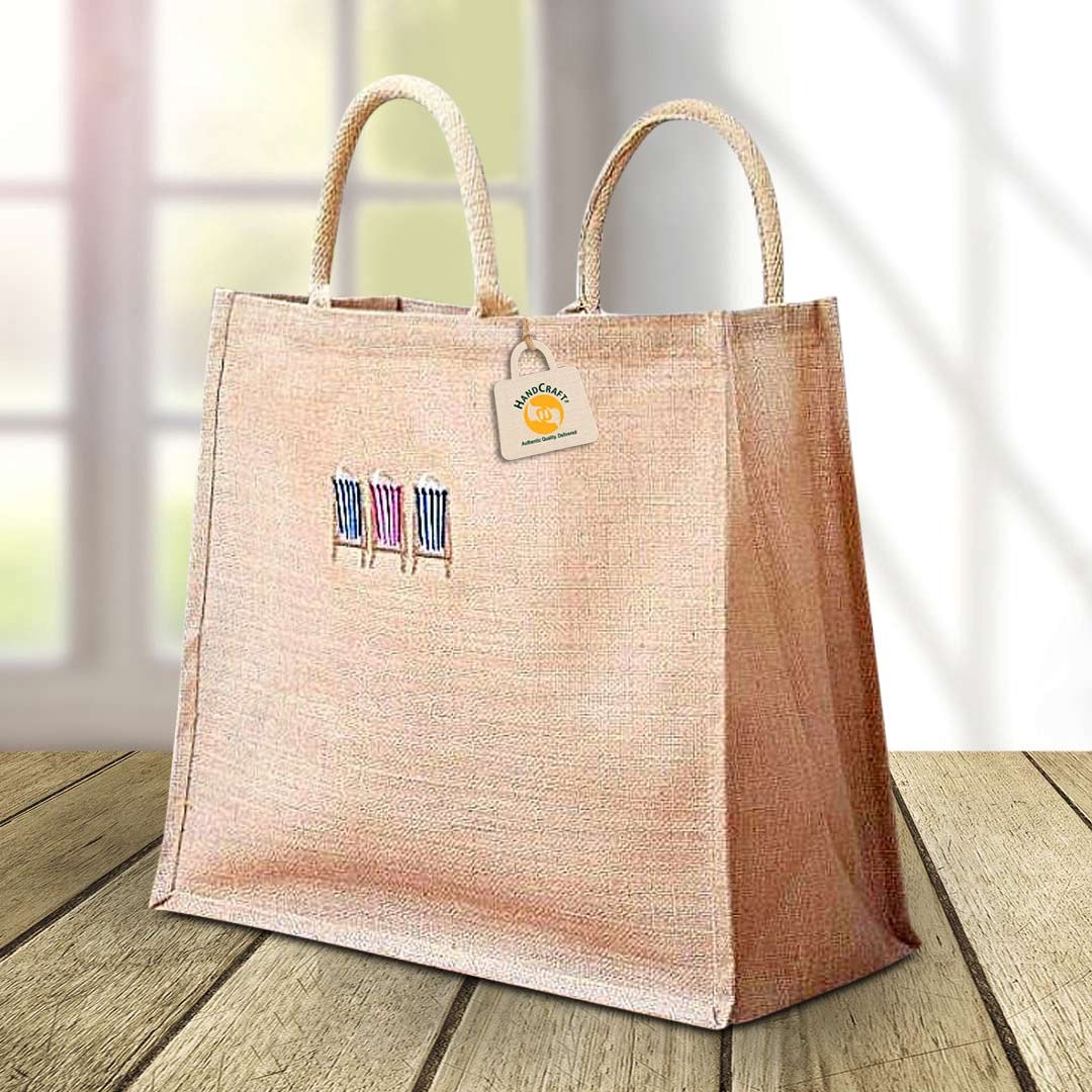
- Ask which panel or panels are printable on the chosen product.
- Keep the main mark clear of seams and handle stitching.
- Decide whether gussets carry anything; they fold, so detail there is rarely read.
- Choose whether both sides carry the same design or one side stays plain.
No universal print area applies to every bag. The suitable area is confirmed for the specific product and size you order.
Keep the design consistent with how the bag will be used
A bag kept for everyday use benefits from a calm, permanent mark. A bag for a single event can carry an event name, but dated wording shortens its useful life. If the same design will be reordered for repeat programmes, keep a master artwork file and colour references so later batches match.
Review before approval
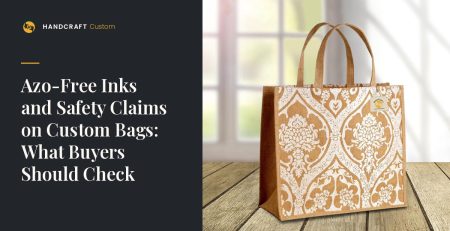
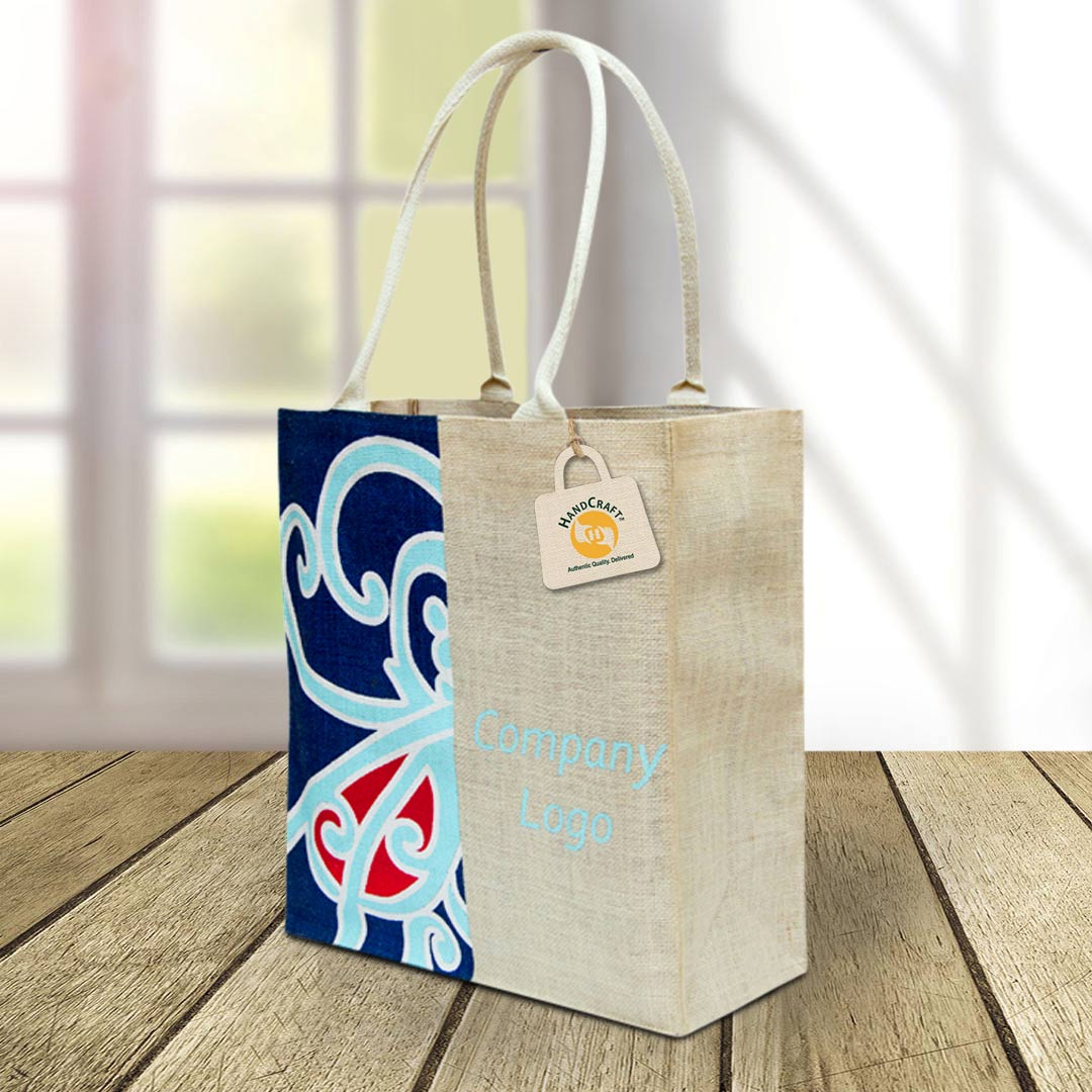
HANDCRAFT uses azo-free printing inks, and the suitable printing method is confirmed for each requirement. Ask what form of approval applies to your order, which may be an approval photograph or a physical sample (decided case by case). When reviewing, check the logo at viewing distance, colour against the fabric, alignment to seams, and spelling. The site’s artwork guidelines explain file and print-detail preparation.
Logo design for jute bags: checklist
- One primary element chosen and sized for viewing distance
- Colours checked against natural or dyed fabric
- Printable panel confirmed for the actual product
- Seams, gussets and handles kept clear of key detail
- One side or two decided
- Master artwork stored for repeat orders
File formats and colour references
Supply artwork as vector files (AI, EPS, PDF or SVG) with fonts outlined, and give ink colours as Pantone references where possible. A one- or two-colour version of the logo is often cleaner on jute and simpler to approve. HANDCRAFT uses azo-free inks.
Questions buyers ask
Does a white logo work on natural jute?
White can read well on natural or darker fabric, but contrast and coverage on textured jute should be reviewed against the actual fabric before approval.
Our logo has fine lines. What are the options?
Simplify the mark for the bag, enlarge it, or consider juco or cotton for a smoother surface. How jute weave affects printed artwork explains why.
Have a logo you want to test on jute? Send the vector file, brand colours and intended bag through the Bulk Enquiry route, and follow the artwork guidelines. HANDCRAFT will review the design against the fabric and quote for the order.