Jute Weave and Printing: How Fabric Texture Affects Your Artwork
Jute fabric is woven from thick, natural plant fibres. The result is a visible, textured surface that buyers like for its natural appearance. That same texture affects printing: ink sits on raised threads and can sink into the small gaps between them. Understanding this before artwork is finalised avoids disappointment at proof stage and helps you choose the right fabric for the design. This article focuses on the fabric and artwork. For the full manufacturing sequence, see How Jute Bags Are Made; for the printing order, see Ordering Printed Jute Bags.
What the weave looks like
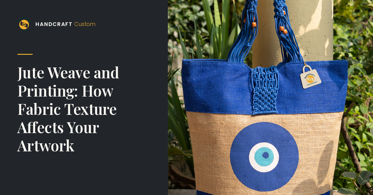
Jute fabric is typically a plain weave: threads cross over and under each other at right angles. Because jute yarns are relatively thick and slightly irregular, the surface shows small peaks and gaps. Weaves vary in tightness; a denser weave gives a more even surface for printing. Natural variation in fibre thickness and colour is normal and part of the material’s character.
How jute weave and printing interact
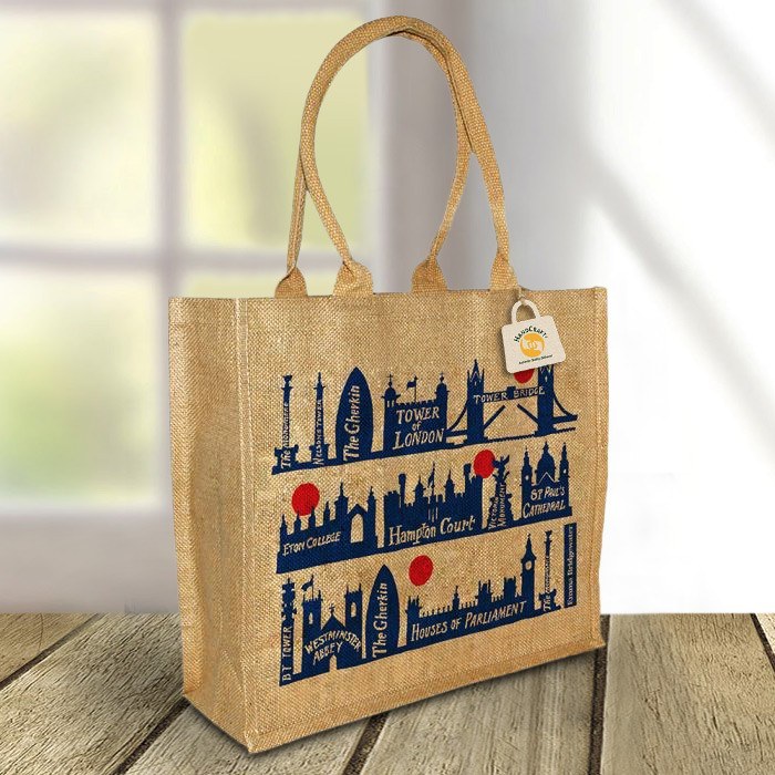
- Fine lines can break up where they cross gaps in the weave.
- Small text can lose legibility, especially serif fonts and thin strokes.
- Gradients and photographs are difficult to reproduce in print and can look patchy on jute.
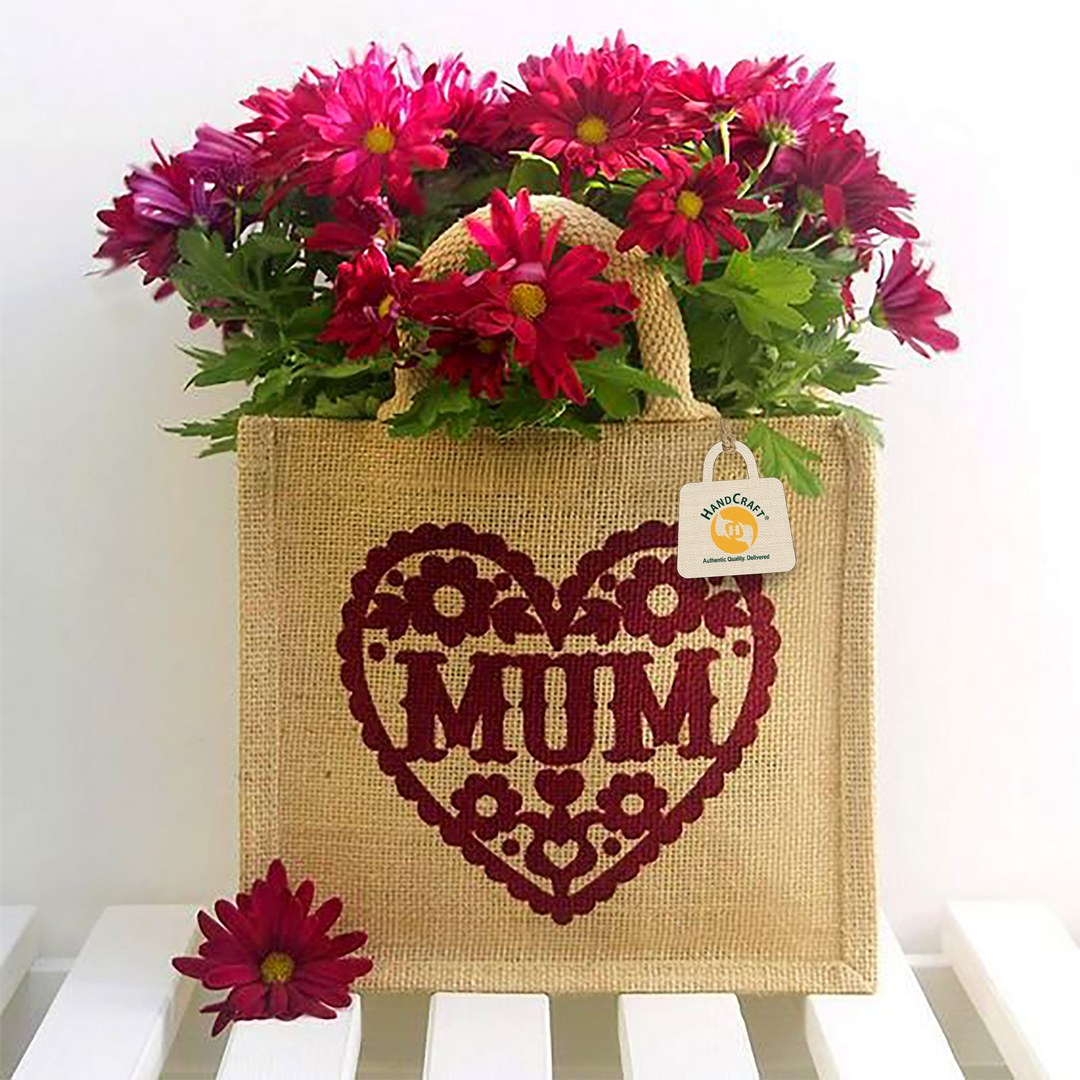
- Large solid areas print well, though a slight texture shows through.
- Light ink on natural jute may need extra ink coverage to look even.
HANDCRAFT uses azo-free printing inks, and the printing method is confirmed for each order. Bold logos and text generally read best on jute.
Designing artwork for jute
- Use bold, simple shapes and avoid hairlines.
- Keep text large, preferring sans-serif fonts with solid strokes.
- Limit the number of colours; each extra colour adds set-up and approval work.
- Convert gradients to flat colour blocks.
- Leave clear space around logos.
- Supply vector files (AI, EPS, PDF or SVG) with text outlined.
When to consider juco or cotton
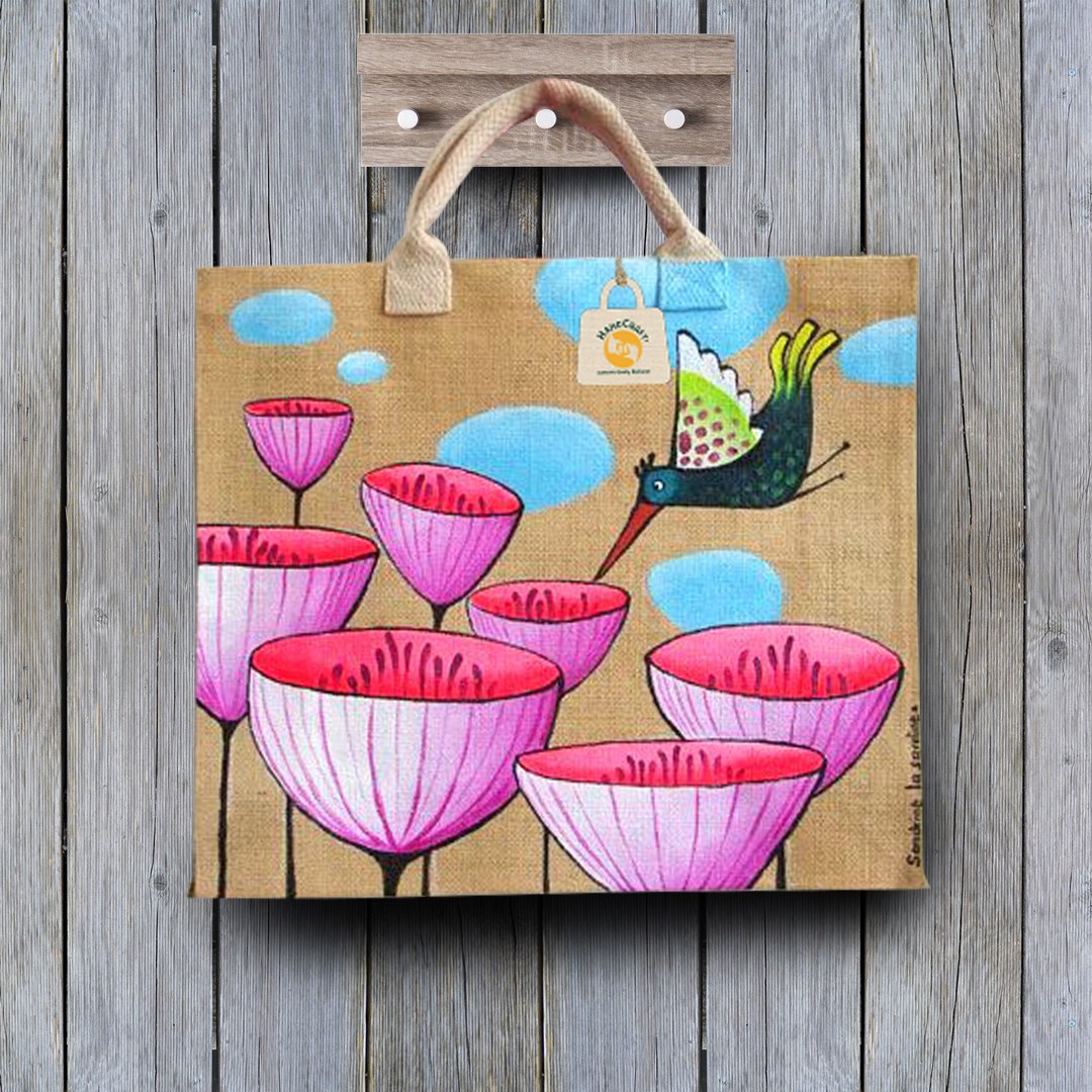
If your design includes fine detail, small text or a detailed illustration, a smoother fabric may suit better. Juco, a blend of jute and cotton, keeps a natural look with a smoother face for finer printing. It is premium and costs more than jute, and is often chosen for niche gifting. Cotton is smoother still. Another option is a jute bag with a smoother front panel for the print area.
Colour on natural jute
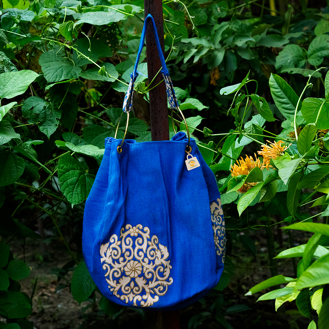
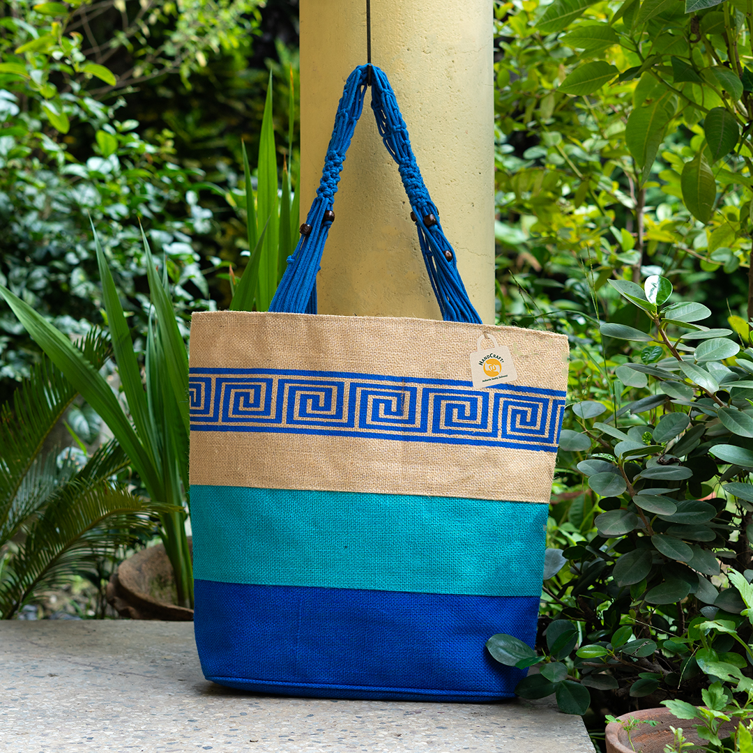
Natural colour means undyed fabric. Its warm, tan base affects how inks appear: light colours look different from how they look on white, and some colours lose contrast. Dark inks such as black, navy and deep green usually stand out. If brand colour accuracy is critical, discuss it at artwork stage. Dyed fabric adds two weeks and extra charges, and the dye colour also affects how inks appear.
Panels, gussets and seams
Print areas should avoid seams, gussets and handle attachment points, where the surface is uneven and ink can sit unevenly. Gusset prints are possible on some formats but need simpler designs. Share preferred placement and size; HANDCRAFT can advise what suits the chosen bag.
Checking at proof stage
A digital proof shows placement and size but cannot fully show how texture will affect fine detail. If detail is critical, ask whether a physical sample is possible; sampling is decided case by case. Approving a simpler version of the logo for jute is common practice and often gives a cleaner result.
Weave and artwork checklist
- Artwork in vector format, with text outlined
- No hairlines or very small text
- Gradients converted to flat colour
- Ink colours checked against a natural or dyed base
- Placement clear of seams and gussets
- Juco, cotton or a smooth panel considered for fine detail
Questions buyers ask
What is the smallest text that prints well?
There is no fixed rule; it depends on the fabric and print. Review at proof or sample stage.
Where are print files covered?
See preparing artwork for printed jute bags. See the artwork guidelines before sending files.
Unsure how your artwork will read on jute? Send the file and intended bag through the Bulk Enquiry route; HANDCRAFT will review it against the fabric before quoting.